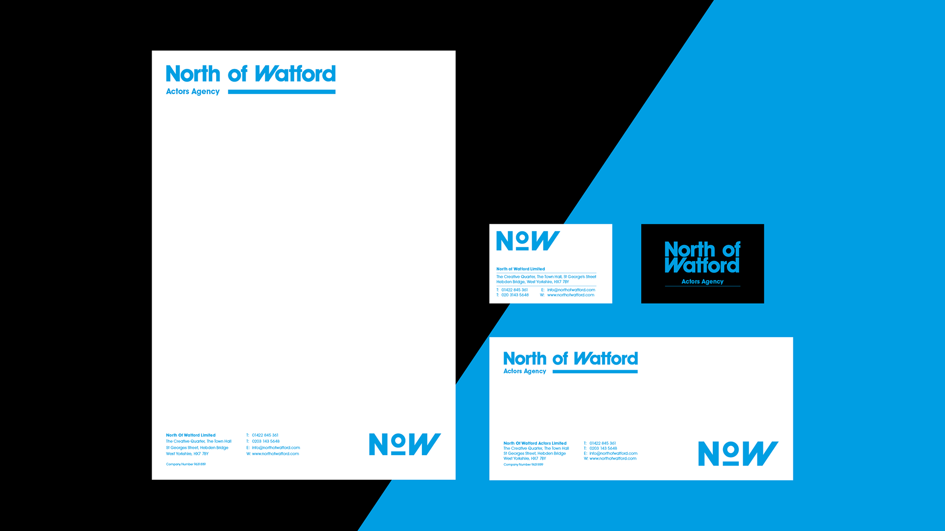
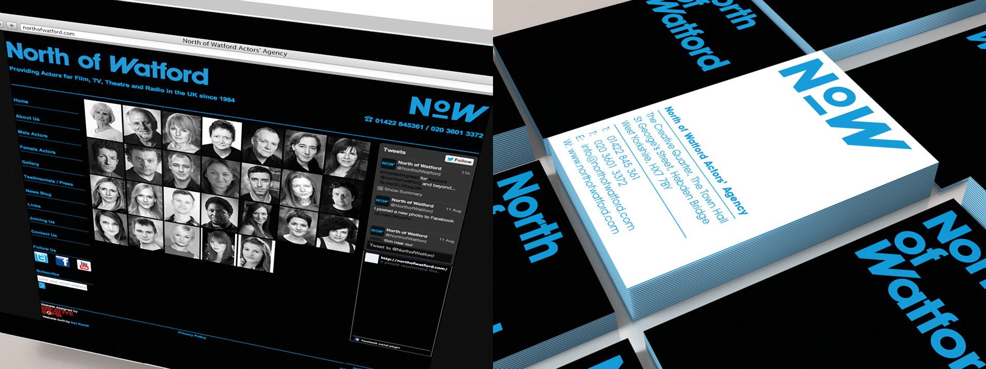
Company Branding
Client: North of Watford
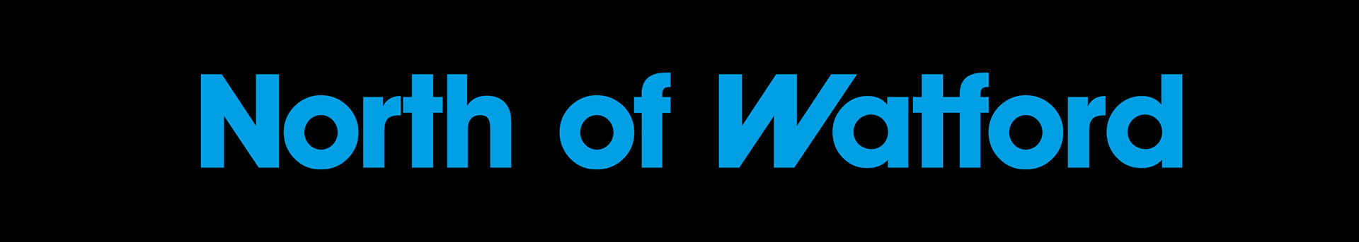
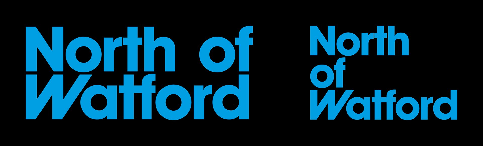
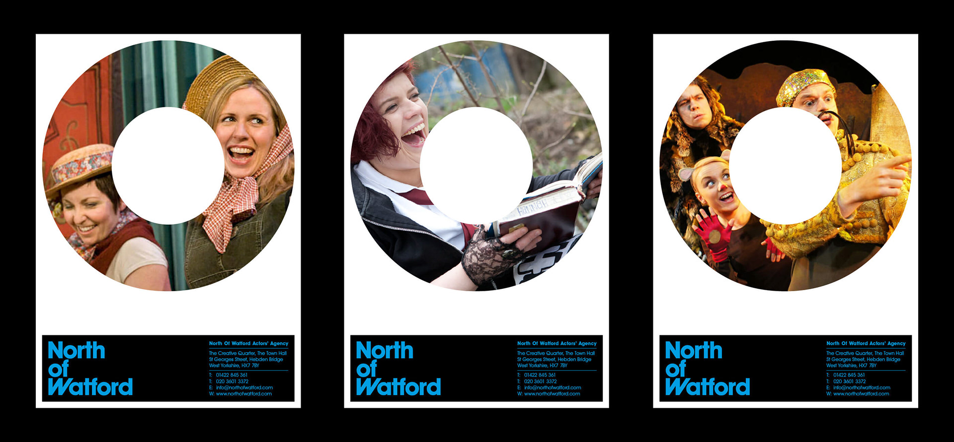
Redesign the branding and visual identity of North of Watford LLP - an actor’s agency based in Hebden Bridge, West Yorkshire.
North of Watford have been in business since 1984 and they were looking for a fresh, new look going in to their 30th year. Primary requirements were a new logo, business stationery and website makeover. The one thing North of Watford were keen to retain from their previous identity was the colour palette – cyan and black.
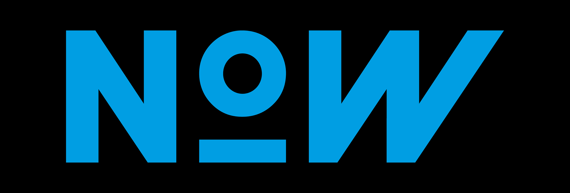
Staff members and customers often refer to North of Watford by the acronym - NOW.
While exploring type treatments for their new brand, it struck me that there is a certain
symmetry in the word NoW which led me to creating the ‘W’ in Watford from a the ‘N’ character. The O is representative of an actor on a stage or someone performing under a spotlight.